
Article: The Beauty of Blue Abstract Wall Art in Modern Interiors
The Beauty of Blue Abstract Wall Art in Modern Interiors
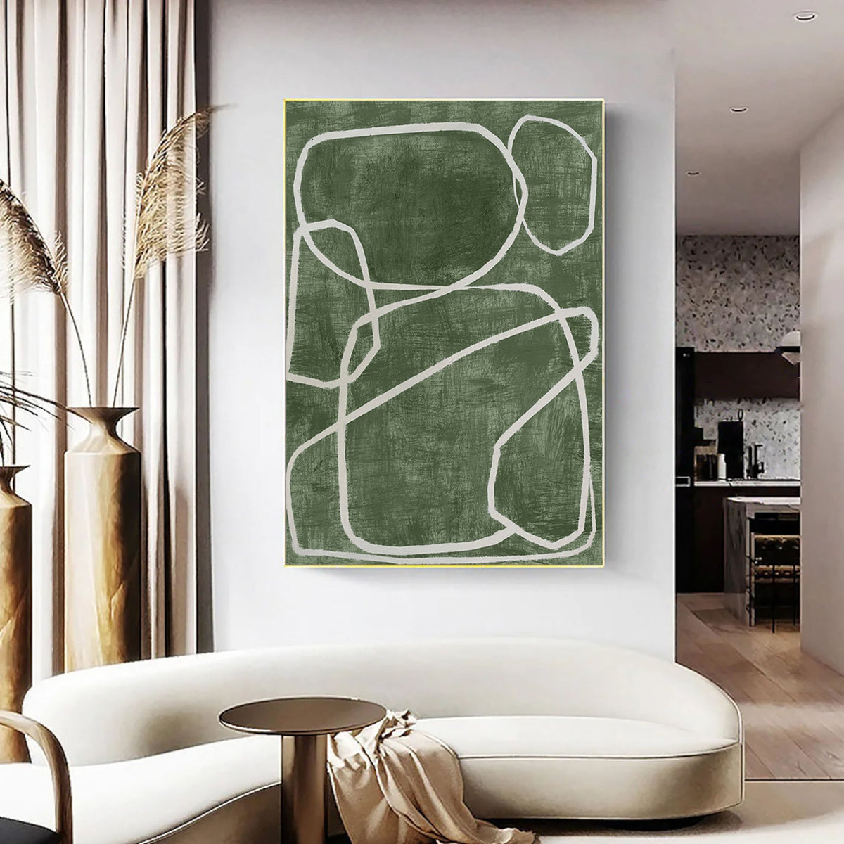
Direct Answer: Blue abstract wall art works in modern interiors because the color reads as calm and spacious rather than loud, letting it anchor a room without fighting the furniture around it. Paired with green abstract wall art or a blue-green canvas wall art piece, it adds depth while keeping the palette cohesive.
Introduction
Choosing wall art is rarely just about matching a sofa. It's about deciding what mood a room should carry. Blue abstract wall art has become a go-to choice for exactly this reason; it's flexible enough to sit in a minimalist living room, a quiet bedroom, or a busy office, and it doesn't demand the space to compete with it. This piece looks at why blue abstract pieces work so well in modern homes, how to pair them with tones like green, and what to actually check before you buy one.
Why Does Blue Abstract Wall Art Suit Modern Spaces?
Modern interiors tend to lean on clean lines, neutral bases, and a handful of intentional focal points. Blue abstract paintings fit that formula naturally. Instead of a literal scene competing for attention, abstract brushwork and color movement give the eye something to explore slowly, which is part of why abstract expressionist-style pieces feel at home in contemporary settings. A single large canvas over a sofa or bed can do the work of several smaller decor items combined.

There's also a practical side: blue is one of the easier colors to build a room around. It sits comfortably next to white walls, grey furniture, warm wood tones, and black accents alike, so a painting rarely forces you to redecorate everything else.
What Does Blue Actually Do to a Room?
Color affects mood more than most people account for when decorating. Blue is widely associated with calm, focus, and openness, which is why it tends to work in spaces meant for rest or concentration rather than high-energy socializing. An abstract composition amplifies this, since there's no fixed subject pulling attention in one direction; the color itself does the emotional work.
Shade matters too. A pale, washed-out blue feels airy and expansive, useful in smaller rooms. A deep navy or indigo abstract piece leans more dramatic and grounding, better suited to rooms with higher ceilings or a stronger architectural presence already in place.
How Do You Pair Blue With Green Abstract Wall Art?
Blue and green sit next to each other on the color wheel, which is why blue-green canvas wall art pieces, where the two tones blend within a single composition, tend to feel harmonious rather than clashing. If you're working with separate pieces instead of one blended canvas, here's a simple way to think about the pairing:
- Living rooms: A dominant blue piece with smaller green accents (plants, cushions, or a second smaller canvas) keeps the room grounded without feeling matchy.
- Bedrooms: Softer, muted blues paired with sage or olive green tones lean calming rather than energizing, useful in a space meant for rest.
- Home offices: Cooler blue-greens together can support focus, since neither tone pulls too much attention from the other.
Where Should You Hang Abstract Wall Art?
Placement changes how a painting reads almost as much as the painting itself does:
- Above furniture: Keep the bottom edge roughly six to eight inches above a sofa, headboard, or console table, close enough to feel connected, not floating.
- Eye level on an open wall: Center the artwork around 57 to 60 inches from the floor, the standard gallery height that works for most ceiling sizes.
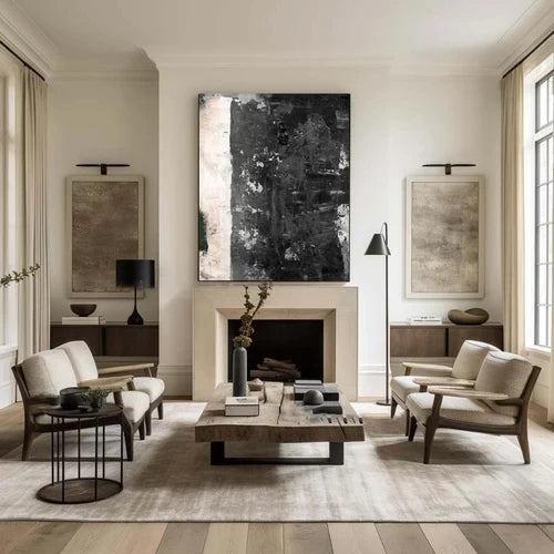
- Statement walls: A single oversized blue abstract canvas can replace an entire gallery wall arrangement, often the simpler, more modern-feeling option.
What Should You Check Before Buying Abstract Wall Art?
A few practical questions make the difference between a piece that elevates a room and one that ends up feeling like an afterthought:
|
Consideration |
Why it matters |
|
Canvas size vs. wall size |
A painting that's too small on a large wall reads as an afterthought; oversized on a small wall feels cramped |
|
Hand-painted vs. print |
Hand-painted originals carry texture and brushwork depth that prints can't fully replicate |
|
Lighting in the room |
Natural light shifts how blue tones read through the day; worth viewing under your actual lighting if possible |
|
Existing color palette |
Note your wall color, flooring, and largest furniture piece before choosing a shade of blue |
A Note on Craftsmanship
Artvista's paintings are hand-painted in Shenzhen's Dafen Oil Painting Village, a community built around generations of oil painting practice. That matters for abstract work specifically; the texture of layered brushstrokes, visible in pieces inspired by abstract expressionism, cubism, 3D minimalist painting, and Wabi Sabi aesthetics, adds depth to a blue abstract canvas. It's a detail that's hard to reproduce in a flat print.
Conclusion
Blue abstract wall art earns its popularity honestly; it's calming without being boring and flexible enough to fit in almost any modern room. Whether you choose a solo blue statement piece or lean into a blue-green canvas wall art combination, the goal is the same: let the painting set the tone for the room instead of competing with it. Explore Artvista's abstract collection to see how hand-painted work from Dafen Village can fit your space.
Frequently Asked Questions
Does blue abstract wall art work in small rooms?
Yes. A well-proportioned piece can introduce color and visual interest without overwhelming a small room. Lighter or mid-tone blues may feel less visually heavy than very dark shades, depending on the room's lighting and existing decor.
Can I mix blue abstract art with other wall decor?
Yes. It pairs well with mirrors, shelving, or a second smaller piece in a complementary tone like green, as long as one item stays the visual focal point.
Is hand-painted abstract art different from a printed canvas?
Yes. Hand-painted works have visible brushwork and texture unique to each piece, while prints reproduce a flat, uniform image.
What styles does Artvista's abstract collection draw from?
Abstract expressionism, cubism, 3D minimalist painting, and Wabi Sabi-inspired art, all hand-created in Dafen Oil Painting Village.

Leave a comment
This site is protected by hCaptcha and the hCaptcha Privacy Policy and Terms of Service apply.