
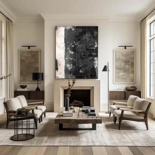
Timeless Contrast: Why Black and White Abstract Art Works in Modern Interiors
Direct Answer: Black and white abstract art can work in a wide range of interiors because it relies on shape, contrast, and texture rather than a specific color palette. The right piece can add visual interest while remaining flexible enough to complement changing furniture and decor.
What Is Black and White Abstract Art?
Black and white abstract art uses black, white, and shades of gray to create interest through line, shape, texture, and composition rather than realistic imagery.
Without a strong color palette directing attention, the focus shifts to contrast and form. Some pieces feature bold, expressive brushstrokes, while others use softer gray layers, geometric shapes, or open negative space.
This variety makes monochrome artwork suitable for many different spaces and personal styles.
Why Does It Work in So Many Interiors?
One of the main advantages of black and white artwork is its flexibility. It does not introduce another dominant color, making it easier to pair with existing furniture, wall colors, and decorative accents.

It can work alongside the following:
-
Warm wood and natural materials
-
Neutral walls and furniture
-
Black metal accents
-
Green plants
-
Brass or gold details
-
Bold accent colors
However, the artwork's size, contrast level, and composition should still suit the room.
How It Fits Different Styles
|
Interior Style |
How It Can Work |
|
Minimalist |
Complements clean lines and restrained palettes |
|
Scandinavian |
Works well with light spaces and natural materials |
|
Industrial |
Adds contrast against concrete, metal, and brick |
|
Mid-century modern |
Complements bold shapes and graphic elements |
|
Traditional |
Can introduce a contemporary focal point |
|
Eclectic |
Provides visual balance among varied colors and patterns |
Choose the Right Level of Contrast
Not all black and white abstract paintings create the same effect.
A piece with strong black brushstrokes and sharp contrast can become a bold focal point in a living room. Softer gray layers and open compositions may feel more subtle and work well in bedrooms or quieter spaces.
Before choosing a piece, consider the atmosphere you want to create:
-
Bold contrast: Strong and visually striking
-
Soft grays: More understated and relaxed
-
Open white space: Light and minimal
-
Dense brushwork: Adds movement and visual weight
How to Choose the Right Piece for Your Space
1. Measure Your Wall
Artwork above furniture often looks balanced when it occupies around 60–75% of the furniture's width. This is a general guideline rather than a strict rule.
Before buying, consider the entire wall and leave enough surrounding space so the artwork does not feel crowded.
2. Consider the Composition
Look at where the visual weight sits in the painting.
Darker areas near the bottom can feel visually grounded, while diagonal lines and expressive marks may create a stronger sense of movement. Clean geometric forms can suit more structured interiors.
Choose a composition that works with the mood and layout of your room.
3. Match Texture With Your Interior
Texture can make a significant difference in how artwork feels within a space.
A hand-painted piece with visible brushwork may work particularly well with:
-
Wood
-
Linen
-
Stone
-
Wool
-
Other natural materials
For rooms with sleek furniture and polished finishes, a cleaner or more geometric composition may feel more appropriate.
Hand-Painted Artwork and Surface Texture
When choosing abstract art, look beyond the image itself. Surface texture and brushwork can add dimension and change subtly depending on the room's lighting.
Artvista's collection includes hand-painted abstract artwork created in Shenzhen's Dafen Oil Painting Village. The collection features different approaches to abstract composition, including expressive brushwork, minimalist forms, and textured surfaces.
When browsing, think about whether you prefer:
-
Bold graphic contrast
-
Visible brushstrokes
-
Layered gray tones
-
Textured surfaces
-
Clean and minimal compositions
These details can help you choose a piece that feels connected to your room rather than simply matching its colors.
Where Should You Hang Black and White Abstract Art?
Placement can influence how the artwork feels in the room.
Above furniture: Keep the artwork visually connected to the sofa, bed, or console rather than placing it too high.
On an open wall: A common guideline is to position the center of the artwork around 57–60 inches from the floor, close to average eye level.
On a statement wall: A large canvas can create a strong focal point, particularly in spacious rooms with enough open wall space.
Before hanging, use painter's tape to outline the approximate size of the artwork. This can help you visualize the placement.
Common Styling Mistakes to Avoid
Choosing a Piece That Is Too Small
A small artwork on a large wall can sometimes feel disconnected. Consider the proportions of both the furniture and the wall.
Focusing Only on Color
Even though the artwork is monochrome, texture and composition still matter. A bold piece may dominate a quiet room, while a subtle composition could get lost in a visually busy space.
Ignoring Lighting
Lighting affects how gray tones, shadows, and surface texture appear. Consider both natural and artificial lighting when choosing your artwork.
Hanging Artwork Too High
Artwork should generally feel visually connected to the furniture below it. Avoid placing it so high that it appears isolated from the rest of the room.
The Bottom Line
Black and white abstract art remains a flexible choice for interiors because it allows contrast, shape, and texture to take center stage.
The best piece is not necessarily the boldest or largest one. Consider the size of your wall, the room's lighting, existing materials, and the level of contrast you want to introduce.
A strong black-and-white composition can create a clear focal point, while softer gray artwork can offer a more understated presence. By choosing the right scale and style, you can find a piece that works naturally with your space and continues to complement your changing decor.
Explore Artvista's collection of hand-painted black and white abstract artwork to find a piece that suits your interior.
Frequently Asked Questions
Does black-and-white abstract art go with every color scheme?
It can work with a wide range of color palettes because it does not introduce another dominant hue. However, the artwork's style, size, and contrast level should still complement the room.
Is black-and-white abstract wall art too plain for a living room?
Not necessarily. Contrast, composition, and texture can create visual interest without relying on color. A bold piece can become a focal point, while softer gray artwork may create a more subtle effect.
What size should abstract artwork be above a sofa?
A common starting point is around 60–75% of the width of the sofa or furniture below it. The ideal size also depends on the wall and surrounding space.
Can black and white abstract artwork work in a small room?
Yes. A well-proportioned piece can create a clear focal point without adding unnecessary visual clutter. Consider the room's layout, lighting, and existing decor when choosing the size and contrast level.
How do I know if an abstract piece is good quality?
For hand-painted artwork, look at the brushwork, paint application, texture, and materials used. Quality should be judged by craftsmanship and how well the piece is made, rather than by whether it is simply hand-painted or printed.
Does black-and-white abstract art suit a bedroom?
Yes. Softer gray tones and open compositions may create a quieter visual effect, while strong black-and-white contrast can feel bolder and more energetic.


留言
此網站已受到 hCaptcha 保護,且適用 hCaptcha 隱私政策以及服務條款。